Finally, I get to talk about Australian chapter books! Kind of. If you thought chapter books were big in the UK, sit back.
Yeah yeah, Bluey has chapter books. No way, I’m not talking about Billie B Brown right now. Either of them. I didn’t finish Lily the Elf in time to write about her this month, so you’re gonna have to wait. It’s Penelope Perfect day. Cover day at least.
Penelope Perfect has two different print runs: the original Australian one by Hardie Grant Egmont and the US/international release by Aladdin.
Very different artists. Very different art styles. Jon Davis did the art for left and… Hardie Grant Egmont is listed for right. I guess another in-house artist? Like I mentioned in my last Cover Story, art style is a subjective topic. So I’m not really gonna talk about it here. I’m more interested in composition and the details they decided to include.
You’ve probably already noticed these arts are two completely different arts. Aladdin did not want to keep the original cover arts. Maybe they thought they weren’t dynamic enough? I’ll let you decide as we look at them all.
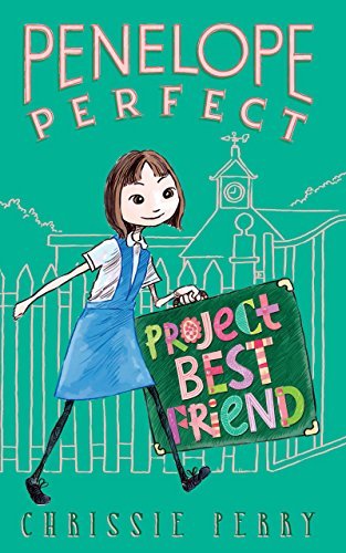
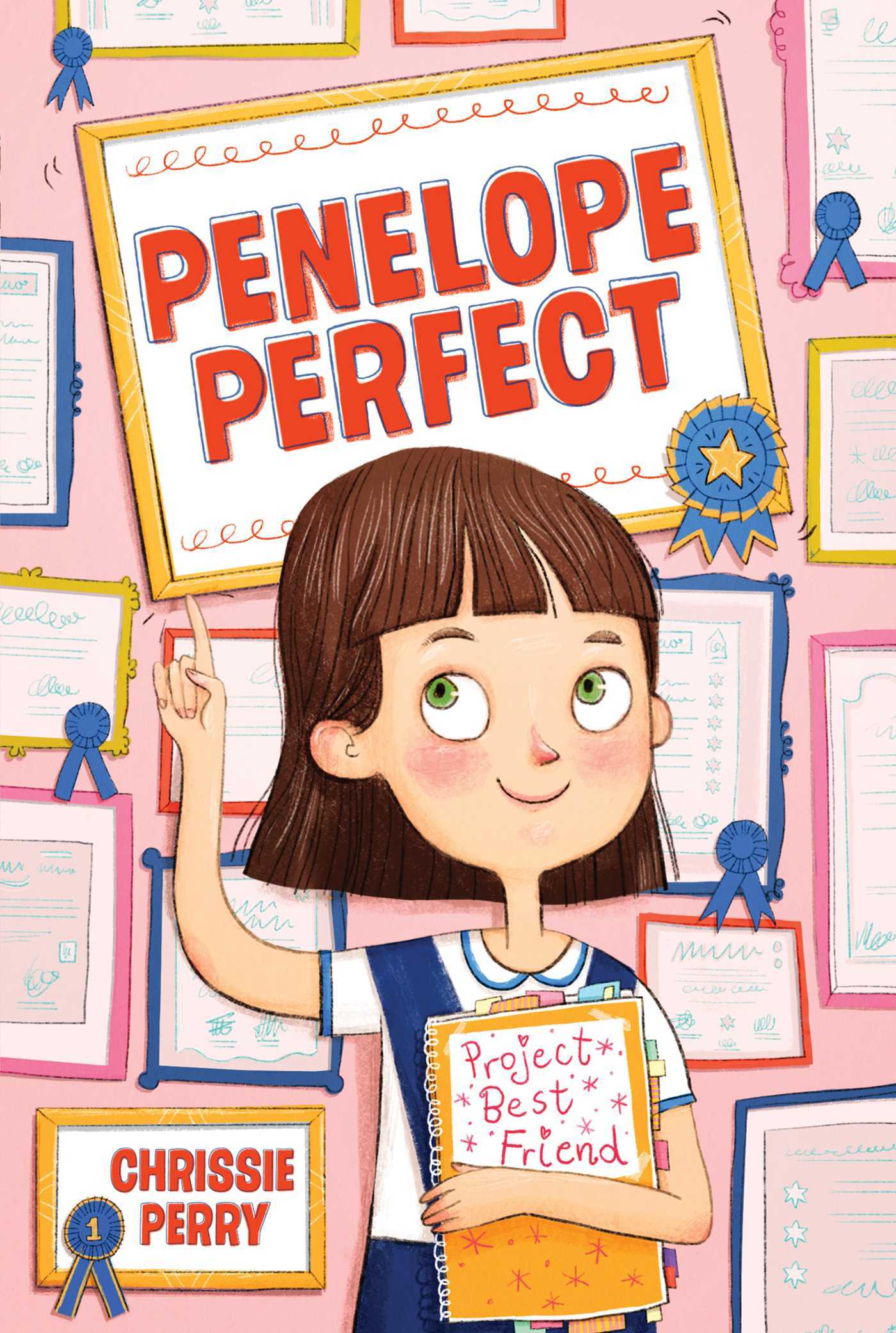
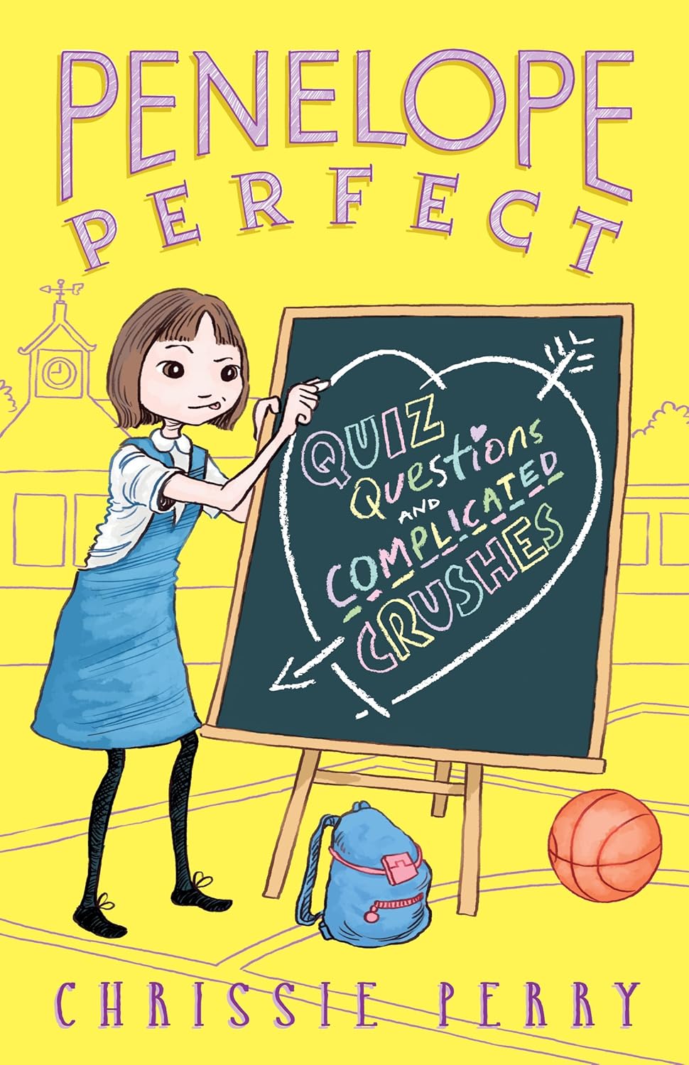
So this is book 1. Penelope really wants a best friend, because everyone else in class has one. Both covers show the same Penelope: same hair, same outfit, same demeanor. Left cover seems to focus more on the “Penelope” aspect and right more on the “Perfect” aspect. Penelope walking to school vs Penelope’s many awards. That number of awards isn’t an exaggeration either. She has a lot of them. The left version also has this cool line art background to bring Penelope out in the foreground more. I will give the right version this: all those awards are different. Someone had to sketch thirteen different awards there.
Also those titles. The series title is consistently the same font and position in the original. In Aladdin’s version, it’s also in the same font and position, but the font is actually straight. Presumably to keep with the “Perfect” part. The book titles themselves are even more interesting, since they’re always incorporated into the art. Left on the case and right on the book. Not in the same fonts as the series title. They didn’t have to do that, but it makes it a lot more fun.
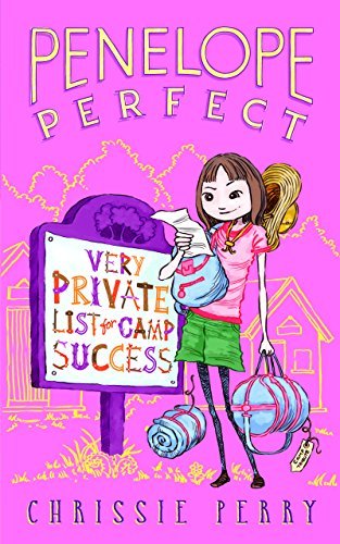
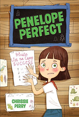
Did you catch it? That book 2 title is just a little different between versions. Why Aladdin left off the “Very” part in the right art is baffling to me. You can see there’s plenty of room on the first line there. This change is reflected on their website too, so it’s official. The only other time I can think a book title was changed between releases was Judy Moody book 1. That original title was a bit long, so they shortened it in later versions. I personally think this is a little disrespectful to the author. They chose those titles intentionally.
What else about book 2? The outfits! Penelope is wearing two very different sets of camp attire. Aladdin’s version keeps her blue/white color scheme from book one. I don’t believe the book mentions her exact clothes, but the inside art matches the original version in all these books. Maybe it is the same artist for both of these covers.
Penelope’s list on the right is also accurate to the story. Nice touch.
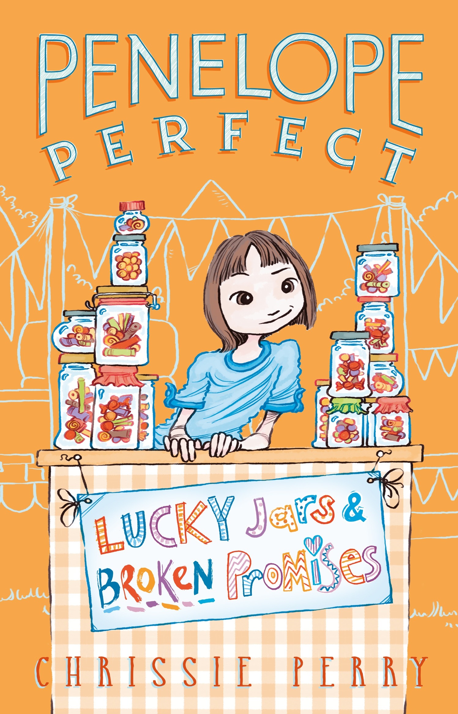
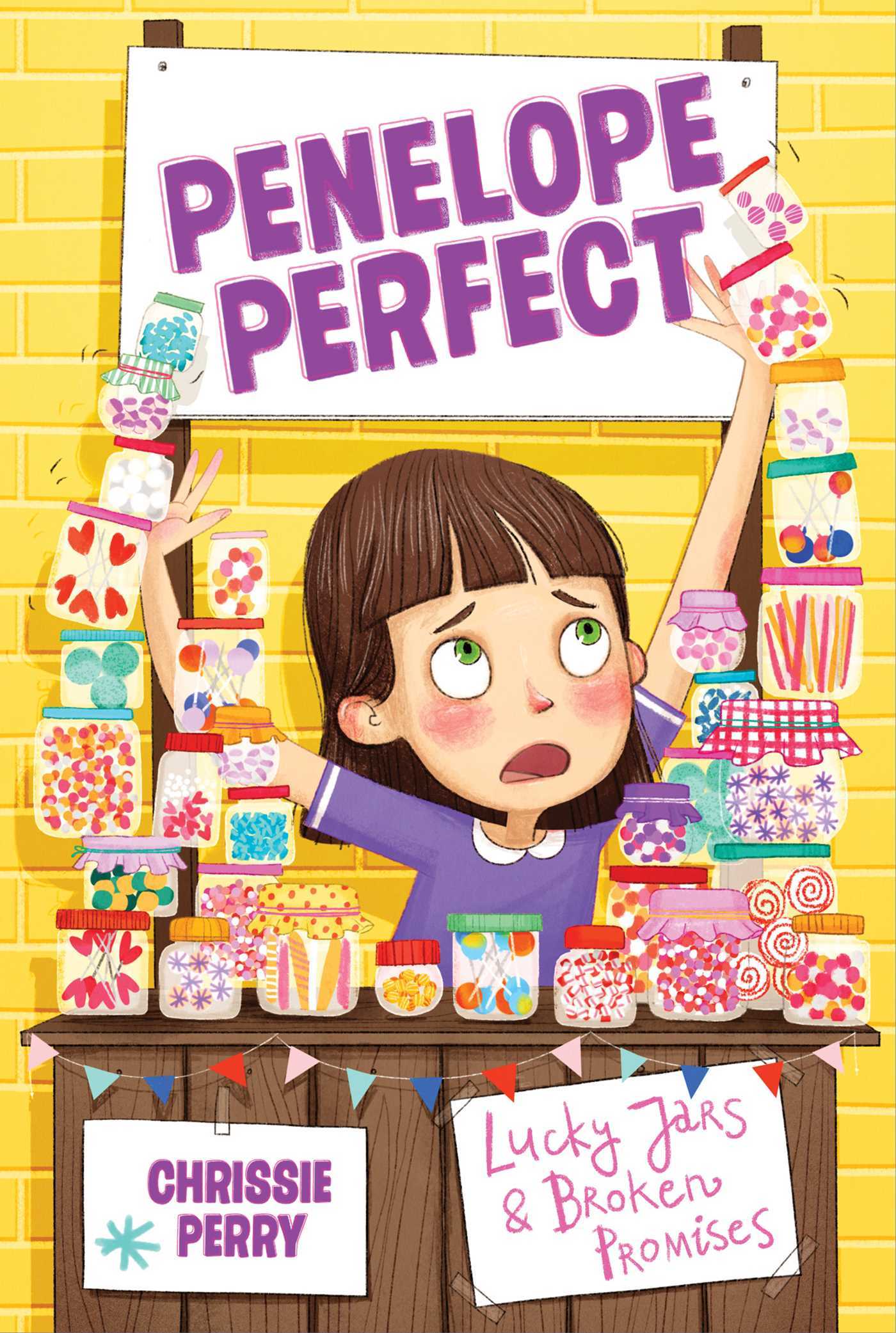
Boy, I really like how each cover incorporates the book title into the art. I can’t think of another chapter book series that does this (though I’m sure there is). I think book 3 is my favorite one so far. The title on the signs is great and really works on the original version, taking up the whole front there.
Continuing what we’ve seen from earlier, Aladdin’s cover is a bit more dynamic, with Penelope struggling to balance the jars. On the original she’s stacked them perfectly, which seems a bit more on theme. I haven’t gotten to book 3 yet, so maybe the jar balancing is book accurate too.
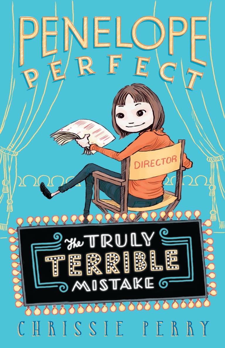
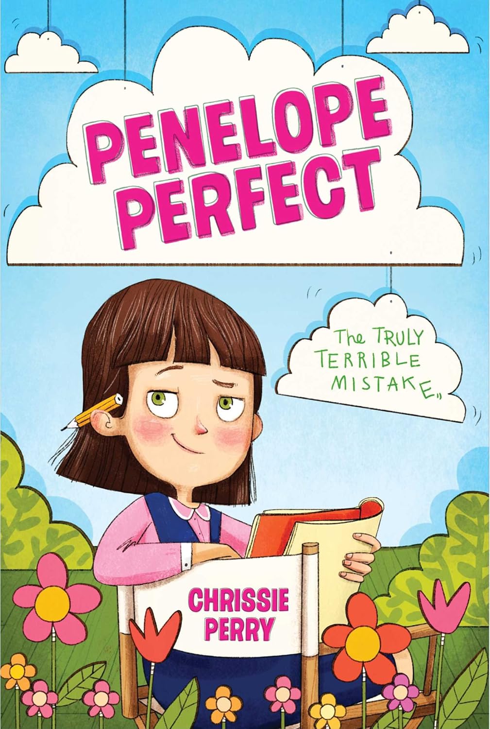
Both book 4s have a similar scene, but left actually has the proper director’s chair. That tells me a bit more about the plot. Right looks more like she’s in a movie or something. There’s way more set dressing on the right at least.
Titles… both on theme, but I really like how right makes it part of the scene in both senses of the word. The marquee on left would have been fine if it was up a bit more. Where marquees usually go. Maybe it’s supposed to be that it’s fallen, kind of like the cloud on the right is shaking. I haven’t read book 4 yet, but I assume like most “school play” books, it doesn’t go as perfect as Penelope hopes.
Book 5 and book 6 only have an Australian release right now. That still means English, but also heavy import fees for most of us. As of the time of writing this, I actually cannot find physical copies of either of these books. This is quite the first. If anyone has any leads, be sure to let me know.
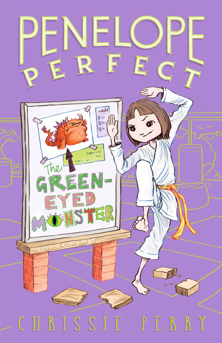
Since there’s no international release, I don’t have anything to compare these ones to. The consistency continues with the book titles being part of the scene. I’m really interested in these two, as crushing on people and taking up karate are both things I wouldn’t take Penelope for. Book 6 I assume is about jealousy, but how Penelope plans to fight that with karate is a mystery…
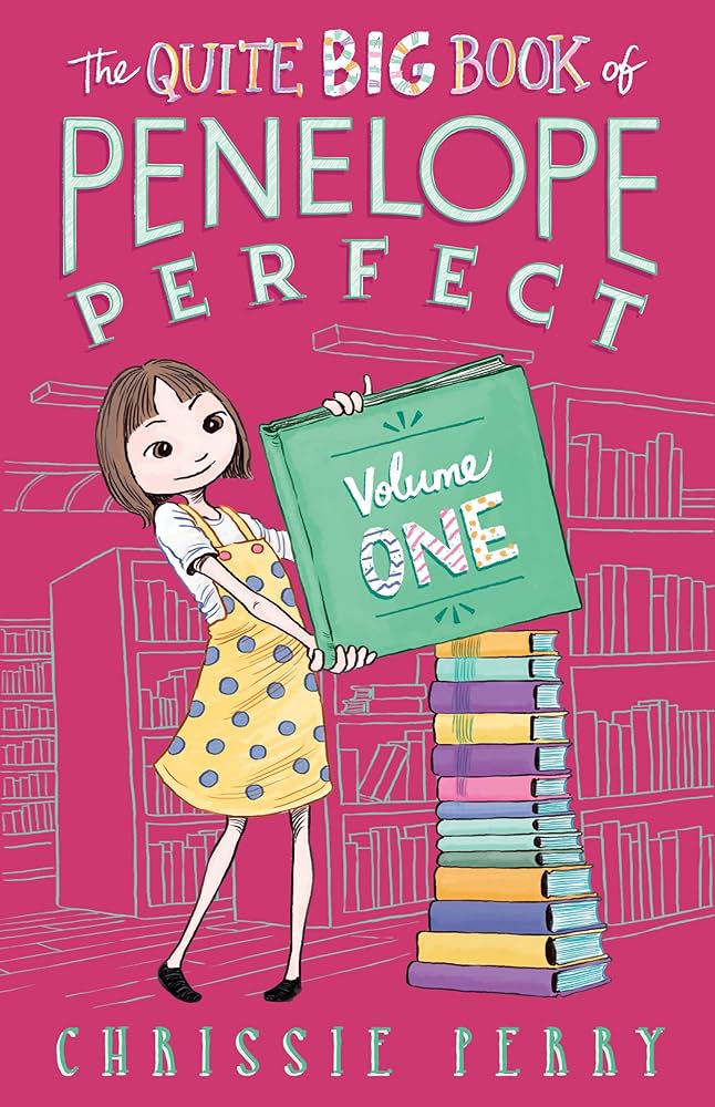
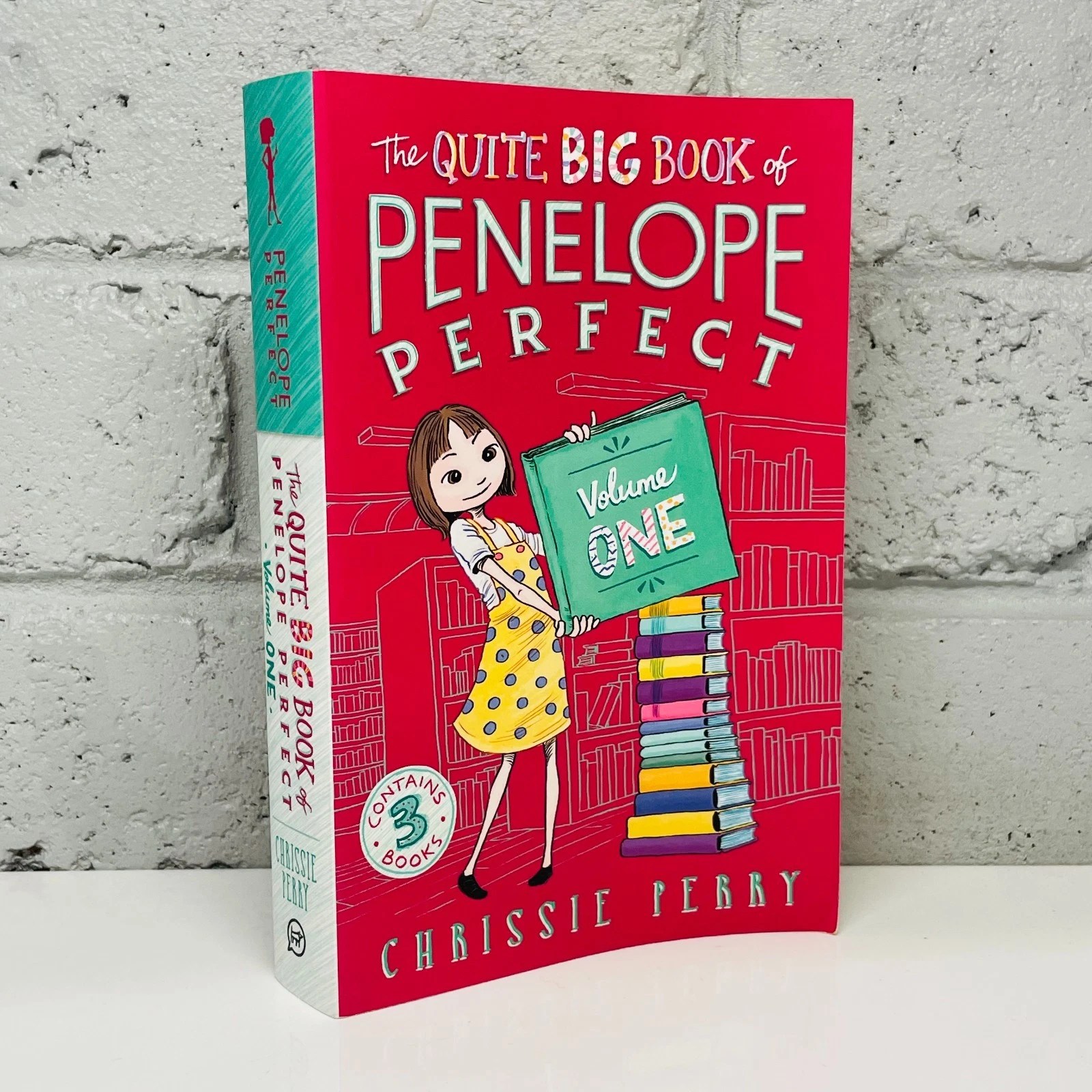
Penelope also has a 3-book collection that covers well… books 1-3. And it has its very own art! Penelope’s got quite the perfect stack of books there. They’re even arranged from biggest to smallest. It looks like the background color differs a bit between the marketing image and actual release. Unfortunately, it doesn’t look like there’s any plans for a volume two, but we’ll see.
Oh yeah, did I mention Penelope is wearing different clothes on most of these covers? Including the collection where they could have easily repurposed art from another book. Very cool. Not every series does this.
A Perfect Enough End
While Penelope might be over, there’s still six books out there to check out. I’m a huge fan, and I’ve only read the first two. You can bet I’ll probably be returning to talk about Penelope some other month. There’s a lot more to cover than just these arts.
